Here is how I read a practice website. I pretend it's 9pm, I've chipped a tooth on a popcorn kernel, I've never been to this practice, and I'm on my phone in bed. I give the page eight seconds to answer two questions. Am I in the right place, and what do I do next. Then I keep reading, generously, because most of these sites were built by someone who cared and then never touched again.
The practice below is a general family dental office in a mid-sized city in the Southeast. One location, one named dentist, standard services. It's a perfectly normal practice, which is exactly why it's worth reading closely.
What they got right
Credit first, because there's real credit here. The phone number is top right with a working call link and the words "Call Us Today" above it. There's a "Request Appointment" button in the hero, not buried in a menu. The hours are on the home page. There's a real photograph of the building further down. And there are actual prices on the page, an exam and x-ray package and a cleaning package, which is more transparency than most practices manage.
There's also a line under the contact form asking patients not to submit protected health information. Someone, at some point, thought about compliance. That matters and I'll come back to it.
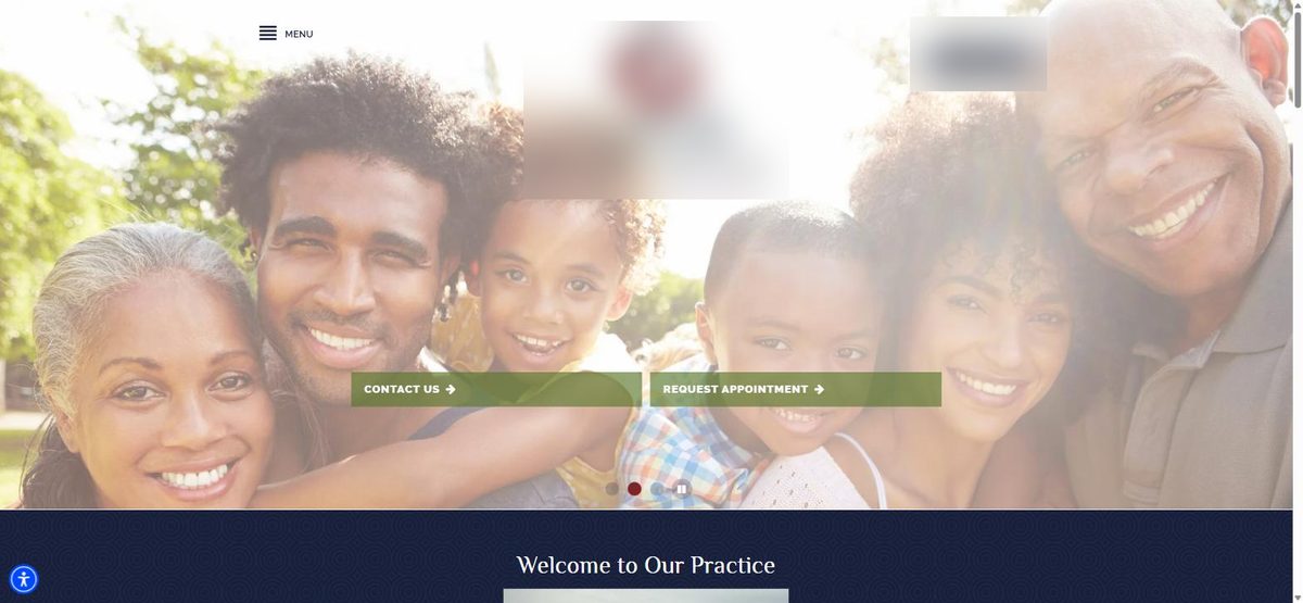
The hero is somebody else's family
Nobody in that photo has ever sat in that chair. It's a stock image, and every new patient knows it's a stock image, because they've seen the same smiling multigenerational family on a bank's website last week. It doesn't hurt exactly. It just doesn't do anything, and the hero is the most expensive real estate the practice owns.
The practice has a real photo of its own building. It's below the fold. The dentist's name is in the logo and appears nowhere else on the home page. No photo of the doctor, no photo of the front desk, no photo of the operatory. A nervous patient at 9pm is trying to picture walking in. Give them something to picture.
"Welcome to Our Practice" is not a headline
The first words a patient reads after the photo are "Welcome to Our Practice." That's a greeting, not a headline. A headline has one job. It answers "am I in the right place" so the patient stops scanning and starts trusting.
This practice does same-day emergency treatment. That is the single most searched-for thing a dental patient wants at 9pm with a chipped tooth, and it's buried in a comma-separated list in paragraph two. "Same-day emergency appointments. Open 8 to 5, four days a week." That's the headline. It was already on the page. It just wasn't where anyone would see it.
"Request Appointment" is a form, not a booking
I tapped the button. It's a contact form. Name, email, phone, notes, submit. The copy further down explains that "our team will reach out to you to confirm the details."
At 9pm the patient doesn't want a promise. They want a slot. And this practice is closed Fridays, so a request sent Thursday night sits in an inbox until Monday morning. By Monday that patient has been seen somewhere else. The form isn't wrong. It's just a leak, and the patient who filled it out doesn't even know they leaked.
The fix isn't necessarily full self-scheduling. A request that triggers an instant text back, "Got it, we'll have a time for you first thing tomorrow, reply here if it's urgent," keeps the patient in the practice's pocket instead of in a competitor's search results.

The testimonial that isn't
The testimonials section is a carousel with three slides. All three are the same sentence. All three are attributed to "The Johnson Family." That is the website platform's sample content, the thing you're supposed to replace with real reviews, and it has been sitting there in public for years.
A new patient can't tell if it's real. So it reads as fake. And one fake-looking review does more damage than no reviews at all, because it makes the patient wonder what else on the page is pretend.
Meanwhile this practice has real Google reviews from real patients, the kind that actually move a nervous person to book. None of them are on the site. The most persuasive words the practice owns are sitting on Google, and the least persuasive words on the internet are sitting on the home page.
The copy belongs to the platform
Scroll past the hero and there are three long paragraphs under headings like "Quality Care" and "Informed Patients." They say things like "informed patients are better prepared to make decisions regarding their health and well-being." That sentence appears, word for word, on thousands of dental websites. It's the platform's default copy, and it was never replaced.
None of it says anything a competitor couldn't say. None of it is about this dentist, this building, this front desk, these patients. The one genuinely distinctive thing on the page, the published prices, is three screens down under a heading that says "Current Promotions," where a patient scanning for "how much is this going to cost me" would never think to look.
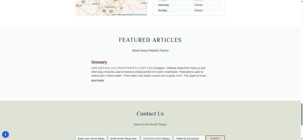
Nobody's home
Near the bottom there's a "Featured Articles" section. The featured article is a glossary. It starts with "A B C D E F G" and then defines amalgam. Rotate the carousel and you get a newsletter dated April 2022, and a page called "Your Rights and Responsibilities as a Patient."
No patient has ever wanted to read a glossary. What this section actually communicates is that nobody has looked at this website in a long time. And patients translate that, fairly or not, into nobody looking closely at anything else either.
What's missing entirely
Three things a new patient looks for that aren't on the home page at all. Which insurance the practice takes, which is the most common question a front desk gets. Who the dentist is, with a face and two sentences. And what a first visit is like, how long it takes, what to bring, whether it'll hurt.
The site does say to bring an insurance card. It doesn't say which cards work.
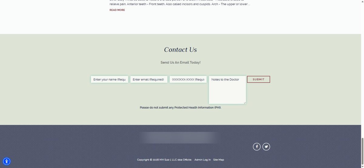
The compliance line that fights the form
Back to that line I promised to come back to. The contact form has a big text box labelled "Notes to the Doctor." Directly under it, in small type, "Please do not submit any Protected Health Information."
A patient with a toothache has no idea what protected health information is. They've just been told to write a note to the doctor, so they'll write "my back left molar has been throbbing for three days and I take blood thinners." That's PHI. The form invited it and the disclaimer forbade it in the same breath. This isn't a compliance failure exactly, but it's the kind of thing a real compliance review would catch in a minute, and it tells you that nobody has done one.
The verdict. This practice is probably good at dentistry. It has the raw materials of a strong website, real prices, real hours, a real building, real reviews on Google. Almost none of them made it to the page, and the page is filled instead with things the platform shipped by default. A new patient at 9pm gets eight seconds of stock family and a greeting, and then goes back to the search results.
What I'd do in a week
Day one. Replace the stock family with the practice's own photo, doctor and front desk included. Replace "Welcome to Our Practice" with the one thing that matters most to the patient they most want. For this practice, same-day emergency care.
Day two. Pin the phone number and a booking button to the bottom of the screen on mobile, so they're one thumb away no matter how far the patient scrolls.
Day three. Wire the request form to send an instant text back, and route after-hours requests to somebody's phone, not an inbox that opens Monday.
Day four. Delete the Johnson Family. Pull in the practice's real Google reviews, most recent first, with the star rating visible.
Day five. Move the prices, the insurance list, and a short "your first visit" section into the top half of the page. Delete the glossary, the 2022 newsletter, and every paragraph the platform wrote. Fix the form label.
None of that is a redesign. It's a week of moving what the practice already has to where the patient will actually see it.
Three tests to run on your own site tonight
The eight-second test. Open your home page on your phone. Count to eight. Could a stranger say what you do, where you are, and how to book, without scrolling?
The placeholder test. Search your own site for "Welcome to our," "Lorem," and any testimonial attributed to a family with no first names. If any of it is there, your platform wrote your website and you never took it back.
The 9pm test. Tap your own appointment button after hours. If nothing happens until Monday, that's the leak.